Before we start, let’s remember…
How do we add custom CSS to our forms?
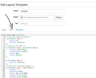
Go to the left side menu: MARKETING / FORMS / LAYOUT TEMPLATES and select the design to add the form styles, once selected we give you EDIT LAYOUT TEMPLATE, and paste the CSS over the existing code in the Form tab, and save.
Remembering this, we start with the styles for the checkboxes.
How to style the checkboxes
One of the disadvantages of using Pardot forms is the inability to modify the HTML structure of the form, so we have to take advantage of standard Pardot HTML to design the checkboxes.
STANDARD HTML
As we see in the HTML code, all checkboxes are wrapped in a paragraph tag, with the class pd-checkbox. This is how we will name it in the CSS.
See the Pen
El HTML de las casillas de verificación de pardot por defecto by Showerthinking (@Showerthinking)
on CodePen.
CSS STYLES
The default checkbox will be hidden and the :before selector will be used to design the new checkbox, with the desired styles.
(.pd-checkbox : before)
The check icons inside the boxes will be loaded from FontAwesome, so you have to insert the library link to view the icons. The link is inserted inside the head in the HTML structure.
See the Pen
link de www.awesome.com y CSS, checkbox by Showerthinking (@Showerthinking)
on CodePen.
THE RESULT
The checkboxes will look like this once the CSS has been added to the form in Pardot.
See the Pen
Checkbox personalizadas para Pardot by Showerthinking (@Showerthinking)
on CodePen.
As you can see, also within the CSS we have called the FontAwesome library. @import url(‘https://maxcdn.bootstrapcdn.com/font-awesome/4.7.0/css/font-awesome.min.css’) Adding the library loads the verification icons. In the CSS styles, in ‘content’ you put the fontAwesome class of the desired icon.
Radio buttons How do we style it?
The radio buttons are quite similar to the checkboxes, but with a little extra CSS to make them look like a radio button. Just like the checkboxes, we’ll take advantage of the HTML provided by Pardot, so all we have to do to customize them is add CSS.
STANDARD HTML
As we can see, all the radio buttons in Pardot are wrapped in a paragraph label, with the class pd-radio. This is how we will name it in the CSS.
See the Pen
El HTML de los botones de radio en pardot por defecto by Showerthinking (@Showerthinking)
on CodePen.
CSS STYLES
Like the CSS for the checkboxes, the FontAwesome library will load to display the radio button check icon, while the default radio button will be hidden.
See the Pen
Css, botones de radio by Showerthinking (@Showerthinking)
on CodePen.


